Scatter Chart
The scatter chart plots each row as a point in coordinate space. Unlike bar and line charts, scatter is built for coordinate plotting: you can map grouping columns to categorical axes, use solo --select for mixed or value axes, or auto-value from all-numeric columns.
Use scatter charts when individual (x, y[, z]) positions matter — latency vs. price, a 3D point cloud, or categorical x with a continuous y metric. Scatter is opt-in: add -c scatter or run vizb scatter; it is not in the default bar,line,pie bundle.
How vizb builds it
Section titled “How vizb builds it”Scatter supports three input modes. Only one applies per dataset:
| Mode | CLI | What each row becomes |
|---|---|---|
| Grouped | -g / -p |
Categorical x, optional y series, optional z depth — same dimension model as bar/line, rendered as scatter / scatter3D |
Solo --select |
--select (no -g / -r / non-default -p) |
2–3 columns assigned to x,y[,z] — value axes (all numeric) or mixed (category x + value y[,z]) |
| Auto-value | No flags (all-numeric CSV/JSON) | Auto-detected numeric columns as raw coordinates on value axes (type: "value") |
Grouped mode
Section titled “Grouped mode”Grouped scatter follows the same x/y/z dimension model as bar and line — each point is a dot instead of a bar or connected line.
The 1D example uses sales.csv — 10,000 order rows with categorical columns (order_date, region, category, …) and numeric metrics (quantity, amount, total, …). You can also browse live CSV dashboards built from the same file.
1D (X axis)
Section titled “1D (X axis)”One point per X category.
vizb scatter sales.csv -g order_date -p x -o out.html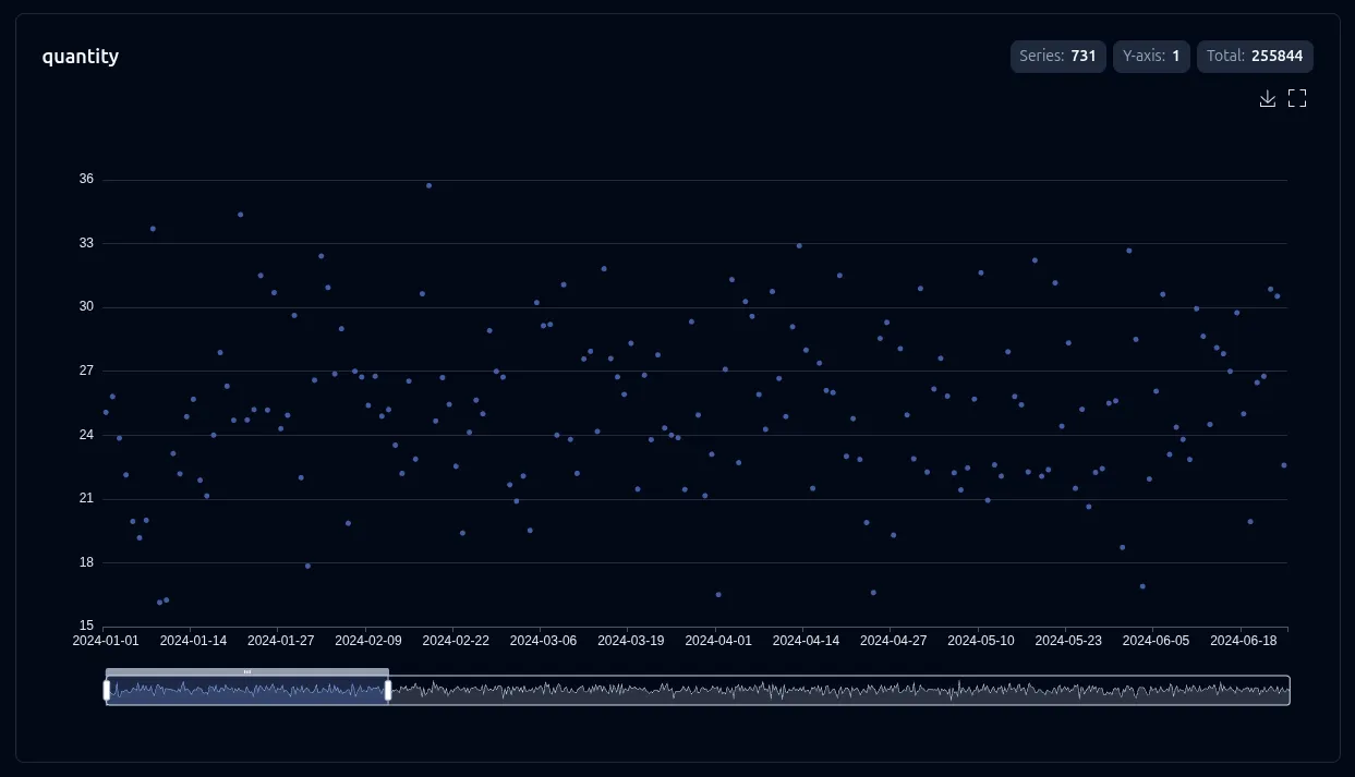
2D (X + Y axes)
Section titled “2D (X + Y axes)”One series per Y value across the X axis. Toggle series in the legend.
vizb scatter data.csv -g region,category -p x,y -o out.html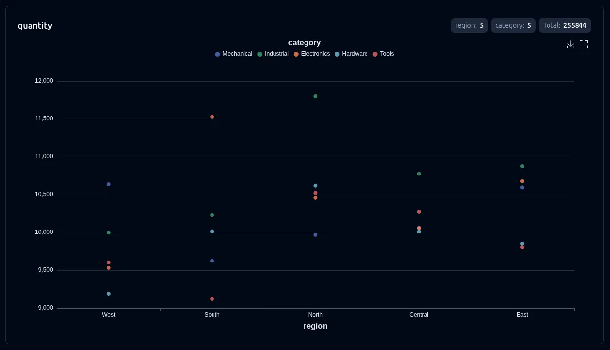
3D (X + Y + Z axes)
Section titled “3D (X + Y + Z axes)”WebGL scatter3D scene: each Z value is a separate point series across the X/Y grid. Rotate, zoom, and pan in the browser. Requires echarts-gl (bundled automatically).
vizb scatter sales.csv -g order_date,category -p "[-y{Month}-x{Date}],z{Category}" -o out.html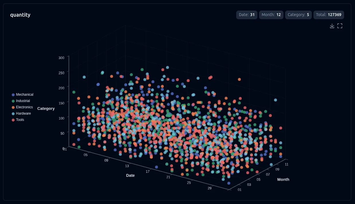
When you have only x and y grouping (no z column), pass --3d to project the same data into pseudo-3D: y categories move to depth and the metric becomes height — the same value-3D toggle bar and line use. See 3D Charts.
--select (csv/json)
Section titled “--select (csv/json)”--select is repeatable (csv/json only). With explicit -g / -p / -r it picks which numeric columns get their own chart, same as bar/line. Without group, scatter is the primary chart for solo --select coordinate plotting — its two signatures are value mode (all-numeric x,y[,z]) and mixed mode (category on x, values on y[,z]).
# Value mode: two numeric columns → 2D scattervizb scatter spiral-3d.csv --select x,y -o scatter.html
# Mixed mode: category region on x, value latency on yvizb scatter region-metrics.csv --select region,latency -o mixed.html
# Three columns → 3D mixed (category x + value y + value z)vizb scatter life-expectancy-income.csv --select Country,"Life Expectancy",Income -o mixed3d.html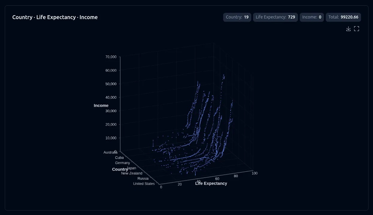
Repeat --select (dim,metric per flag) for multi-stat datasets — charts separate by stat type. This does not enable grouping; use -g/-p when you need explicit group axes or aggregation. See Select for the full mode reference, and Group vs Select for when to use each.
Auto-value mode (no flags)
Section titled “Auto-value mode (no flags)”On an all-numeric CSV/JSON file, vizb auto-detects the first 2–3 columns as coordinate axes and enters value mode automatically — with 3+ columns it renders continuous scatter3D. See Auto-value for the inference rules; solo --select overrides it.
# All-numeric CSV — auto-detects x, yvizb scatter clusters.csv --visualmap --symbol-size 10 -o scatter.html
# Three columns — auto-detects x, y, z and enables 3Dvizb scatter spiral-3d.csv -o scatter.html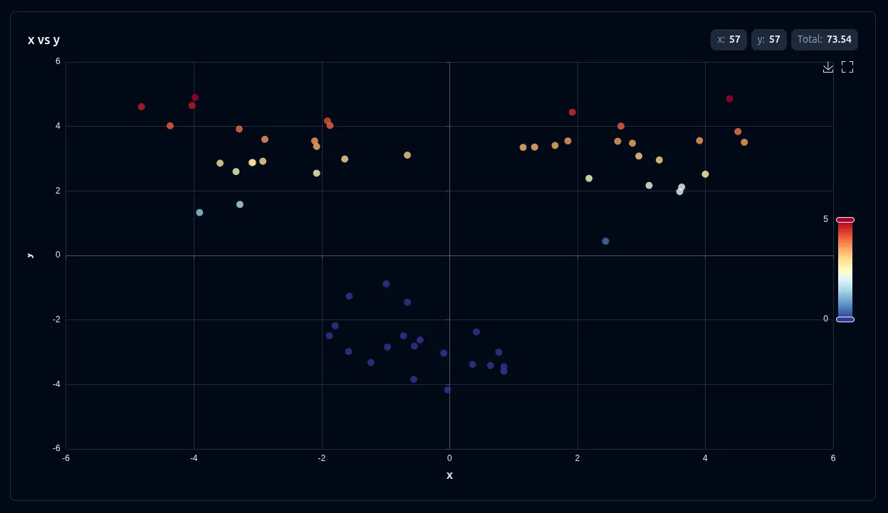
Use the axis swapper in the UI to include or drop z and toggle between 2D and 3D without re-running the CLI.
Settings
Section titled “Settings”These settings apply to scatter charts:
| Setting | CLI flag | UI toggle | Notes |
|---|---|---|---|
| Sort | --sort asc|desc |
Sort control | Grouped mode only — hidden for auto-value and mixed |
| Labels | --show-labels |
Show labels | Point labels where supported |
| Swap | --swap |
Axis switcher | Grouped mode; auto-value with 3 columns |
| Scale (log) | --scale log |
Scale toggle | Log axes — 2D grouped, value, and mixed mode |
| 3D view | --3d |
3D view | Pseudo-3D for grouped x+y (no z column) |
| 3D visual map | --3d-visualmap |
3D visual map | Metric gradient on 3D points |
| 2D visual map | --visualmap |
Visual map | Gradient coloring on 2D scatter — off by default |
| Symbol | --symbol |
Symbol | ECharts marker shape — circle, diamond, pin, arrow, none, … |
| Symbol size | --symbol-size |
Symbol size | Point diameter in pixels |
| Auto-rotate | --3d-rotate |
Auto rotate | Spins the 3D scene — 3D only |
Override settings for just this chart type:
# Log scale and labels on a grouped scattervizb scatter data.csv -g category,metric --scale log -l -o out.html
# Mixed region vs latency with log yvizb scatter region-metrics.csv --select region,latency --scale log -o out.html
# Cluster scatter with visualMap and diamond markersvizb scatter clusters.csv --visualmap --symbol diamond --symbol-size 10 -o out.html
# 3D spiral with auto-rotatevizb scatter spiral.csv -o out.html  # auto-value x,y,z → 3D