Pie Chart
The pie chart shows how a whole breaks into parts. Unlike bar and line charts, pie has no cartesian axes — vizb maps your dimensions to multiple pie charts rendered side-by-side, one per axis. Each slice carries its name and percentage, so the composition of your dataset is immediately readable.
Use pie charts when you care about proportion and share rather than raw magnitude: which dataset name dominates, which configuration contributes the most, or how Z variants divide the total.
How vizb builds it
Section titled “How vizb builds it”Pie ignores the X/Y/Z grid model. Instead, each axis becomes its own standalone pie:
| Dimension | Role |
|---|---|
| XAxis | Each unique X value becomes a slice in the “By X-Axis” pie |
| YAxis | Each unique Y value becomes a slice in the “By Y-Axis” pie |
| ZAxis | Each unique Z value becomes a slice in the “By Z-Axis” pie |
Slice sizes are proportional to the sum of values for that axis entry. Labels show the slice name and its percentage of the total.
Dimensions
Section titled “Dimensions”The examples below use sales.csv — 10,000 order rows with categorical columns (order_date, region, category, …) and numeric metrics (quantity, amount, total, …). You can also browse live CSV dashboards built from the same file.
1D (X axis)
Section titled “1D (X axis)”One pie chart: each unique X value is a slice. The slice size is proportional to its total value. This is the clearest way to see which X category dominates.
vizb pie sales.csv -g region -o out.html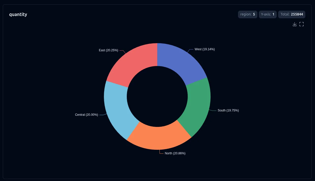
2D (X + Y axes)
Section titled “2D (X + Y axes)”Two pies side-by-side: By X-Axis and By Y-Axis. Each pie breaks the total differently — the first by X category, the second by Y column. Comparing the two lets you see which axis has more evenly-distributed weight.
vizb pie sales.csv -g region,category -p x,y -o out.html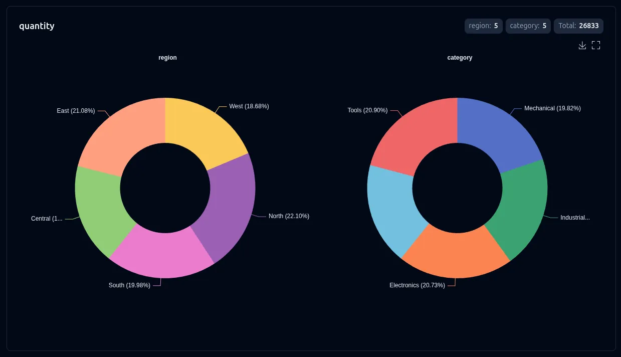
3D (X + Y + Z axes)
Section titled “3D (X + Y + Z axes)”Three pies in a row: By X-Axis, By Y-Axis, and By Z-Axis. Each pie slices the total along a different axis, giving you a three-way breakdown of the same dataset in a single view.
This example splits order_date into month and day slots (same grouping as the Sales by Date CSV dashboard) and maps category to the Z axis.
vizb pie sales.csv -g order_date,category -p "[-y{Month}-x{Date}],z{Category}" -o out.html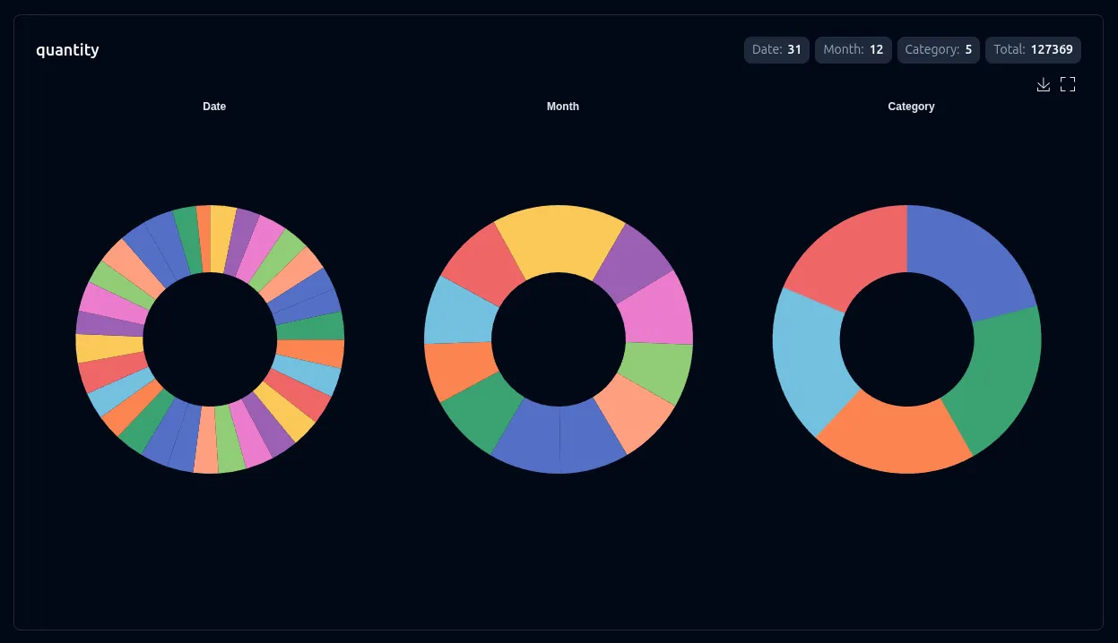
Settings
Section titled “Settings”Pie charts expose three runtime settings — sort, labels, and axis swap.
| Setting | CLI flag | UI toggle | Notes |
|---|---|---|---|
| Sort | --sort asc|desc |
Sort control | Orders slices by value |
| Labels | --show-labels |
Show labels | Shows name + percentage on each slice |
| Swap | --swap |
Axis switcher | Reorders which axis maps to which pie |
Override settings for just this chart type without affecting others:
# Sort slices descending and show labelsvizb pie sales.csv -g region,category -p x,y --sort desc -l -o out.html