Bar Chart
The bar chart is vizb’s default chart type. It maps categories to bars, making it easy to compare values at a glance — whether you have one series or a full three-dimensional dataset. As you add dimensions, bars group and then grow into a full 3D WebGL scene.
Use bar charts when you want direct side-by-side comparison of discrete categories, benchmark names, or labeled data points. If you’re already using bar and want to fold in a z-axis without the depth, the Heatmap is a good complement.
How vizb builds it
Section titled “How vizb builds it”vizb maps your grouping columns to the chart’s visual axes:
| Dimension | Role |
|---|---|
| XAxis | Category axis — each unique X value becomes a bar group |
| YAxis | Series axis — each unique Y value becomes a separate bar within each X group |
| ZAxis | Depth layer — stacks Z values into the X/Y floor grid (3D only, requires echarts-gl) |
Dimensions
Section titled “Dimensions”The examples below use sales.csv — 10,000 order rows with categorical columns (order_date, region, category, …) and numeric metrics (quantity, amount, total, …). You can also browse live CSV dashboards built from the same file.
1D (X axis)
Section titled “1D (X axis)”A single series of bars — one bar per X category. The height is the raw value. This is the simplest view: run a benchmark, pick one grouping column, get a bar per result.
vizb bar sales.csv -g order_date -p x -o out.html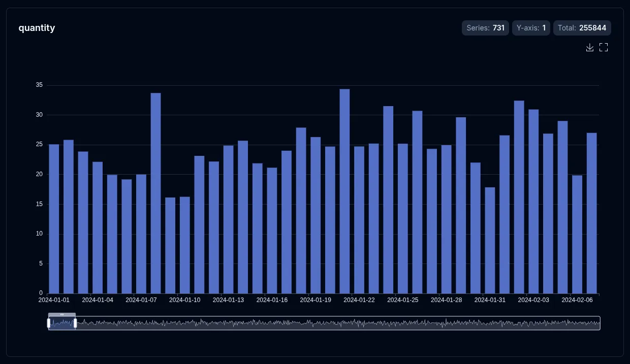
2D (X + Y axes)
Section titled “2D (X + Y axes)”Grouped bars: X stays on the category axis, and each distinct Y value becomes its own bar series side-by-side within each X group. The legend lists the Y values so you can toggle individual series on and off.
vizb bar sales.csv -g region,category -p x,y -o out.html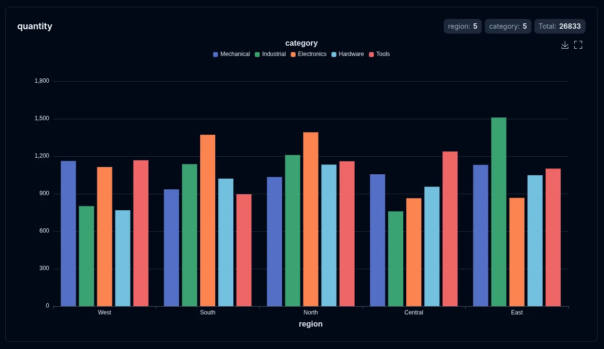
3D (X + Y + Z axes)
Section titled “3D (X + Y + Z axes)”WebGL bar3D scene: X and Y form a grid floor, and Z values stack as depth layers on each (X, Y) cell. Rotate, zoom, and pan the scene in the browser. Requires echarts-gl (bundled automatically).
vizb bar sales.csv -g order_date,category -p "[-y{Month}-x{Date}],z{Category}" -o out.html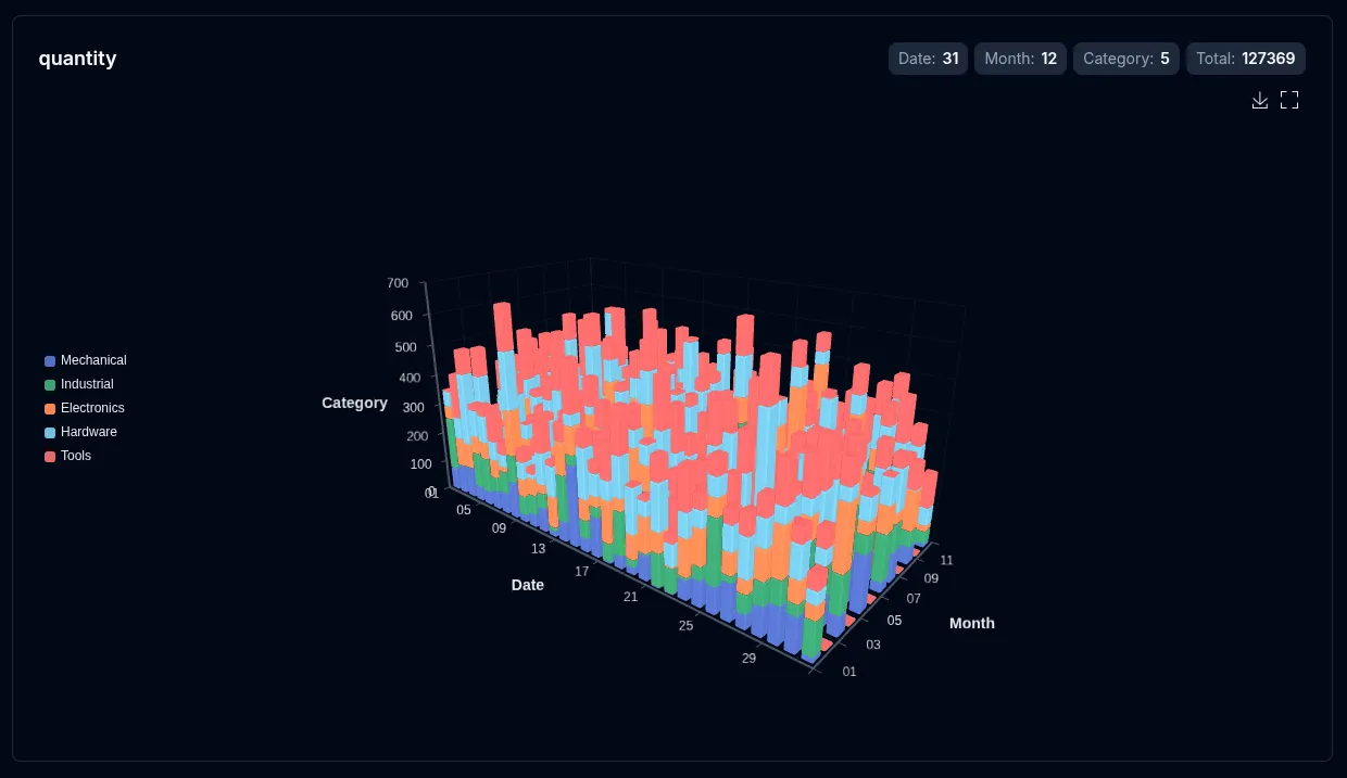
--select (csv/json)
Section titled “--select (csv/json)”--select is repeatable (csv/json only). With explicit -g / -p / -r, it picks which numeric columns get their own chart (optional {label} renames each chart). Without group, it switches to solo value / mixed / multi-stat modes that plot raw columns as coordinate axes.
vizb bar sales.csv -g region,product -p x,y --select amount,total -o bars.htmlSee Select for the full mode reference, and Group vs Select for when to use each.
Auto-value mode (all-numeric data)
Section titled “Auto-value mode (all-numeric data)”On an all-numeric CSV/JSON file, vizb auto-detects the first 2–3 columns as coordinate axes and renders value-type bars — with 3+ columns it auto-enables 3D (bar3D). See Auto-value for the inference rules; solo --select overrides it.
./bin/vizb bar noise-surface.csv -o surface.html --3d-visualmap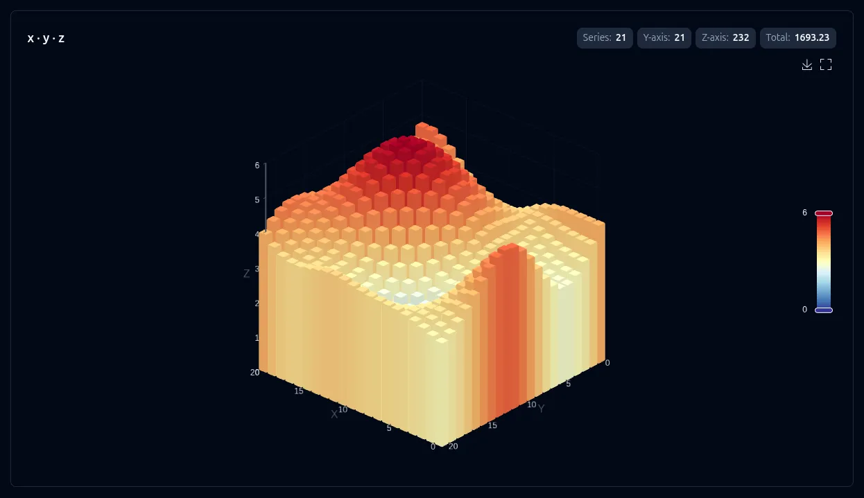
Settings
Section titled “Settings”These settings apply to bar charts:
| Setting | CLI flag | UI toggle | Notes |
|---|---|---|---|
| Sort | --sort asc|desc |
Sort control | Sorts bars along the X axis |
| Labels | --show-labels |
Show labels | Displays value on each bar |
| Swap | --swap |
Axis switcher | Rotates which column maps to X vs Y |
| Scale (log) | --log-scale |
Scale toggle | Log Y axis — 2D only |
| 3D view | --3d |
3D view | Value 3D for x+y data (y → depth, metric → height) |
| 3D visual map | --3d-visualmap |
3D visual map | Metric gradient coloring — on by default with --3d; grouped/value 3D |
| Auto-rotate | --3d-rotate |
Auto rotate | Spins the 3D scene — 3D only |
Override settings for just this chart type without affecting others:
# Sort ascending and show labels on bars onlyvizb bar sales.csv -g region,category --sort asc -l -o out.html
# Log scale on the bar chart onlyvizb bar sales.csv -g region,category --scale log -o out.html