Line Chart
The line chart draws connected data points across your X-axis categories, making it easy to spot trends, regressions, and performance curves. It follows the same dimension model as the bar chart — run the line subcommand and your data renders as lines instead of bars.
Use line charts when the shape of the curve matters as much as individual values: latency vs. input size, throughput vs. concurrency, or any benchmark where you want to see how values change across a sweep.
How vizb builds it
Section titled “How vizb builds it”vizb maps your grouping columns to the chart’s visual axes:
| Dimension | Role |
|---|---|
| XAxis | Category axis — each unique X value is a point on the line |
| YAxis | Series axis — each unique Y value becomes a separate line |
| ZAxis | Z series — each Z value gets its own 3D polyline across the X/Y grid (3D only, requires echarts-gl) |
Dimensions
Section titled “Dimensions”The 1D and 2D examples use sales.csv — 10,000 order rows with categorical columns (order_date, region, category, …) and numeric metrics (quantity, amount, total, …). You can also browse live CSV dashboards built from the same file.
1D (X axis)
Section titled “1D (X axis)”A single line tracing one value per X category. The simplest view: one grouping column, one continuous curve from left to right.
vizb line sales.csv -g order_date -p x -o out.html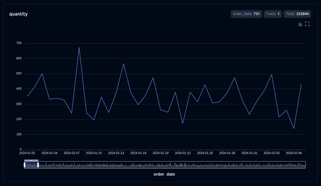
2D (X + Y axes)
Section titled “2D (X + Y axes)”One line per Y value, all sharing the same X axis. The legend lists the Y values so you can show or hide individual lines. Great for comparing multiple algorithms or configurations across the same input sweep.
vizb line sales.csv -g region,category -p x,y -o out.html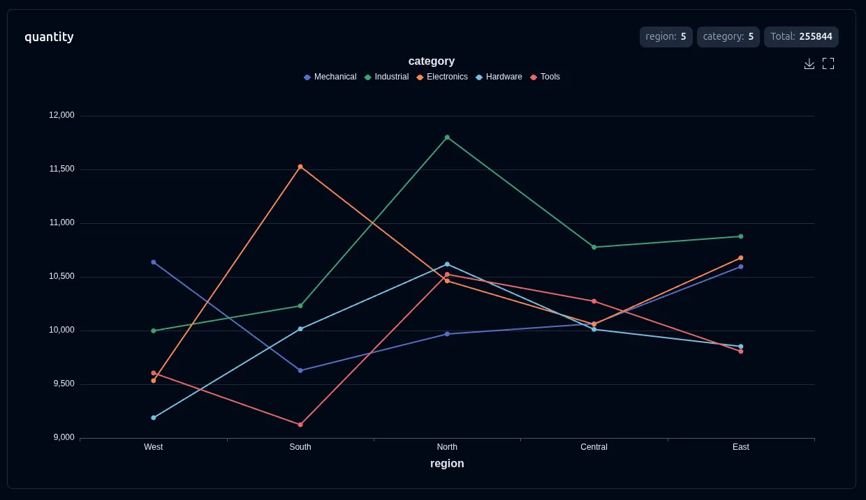
3D (X + Y + Z axes)
Section titled “3D (X + Y + Z axes)”WebGL line3D scene: each Z value becomes a separate 3D polyline with scatter markers at each vertex. The markers keep individual data points readable when lines converge or overlap. Rotate, zoom, and pan the scene in the browser. Requires echarts-gl (bundled automatically).
This example uses Go benchmark output comparing worker pool implementations. Slash-separated names like BenchmarkAllSleep10ms/1u-1Mt/Pond-Eager-8 map to z/y/x — benchmark suite on Z, workload config on Y, pool implementation on X.
vizb line worker-pools.txt -p z/y/x --scale log -o out.html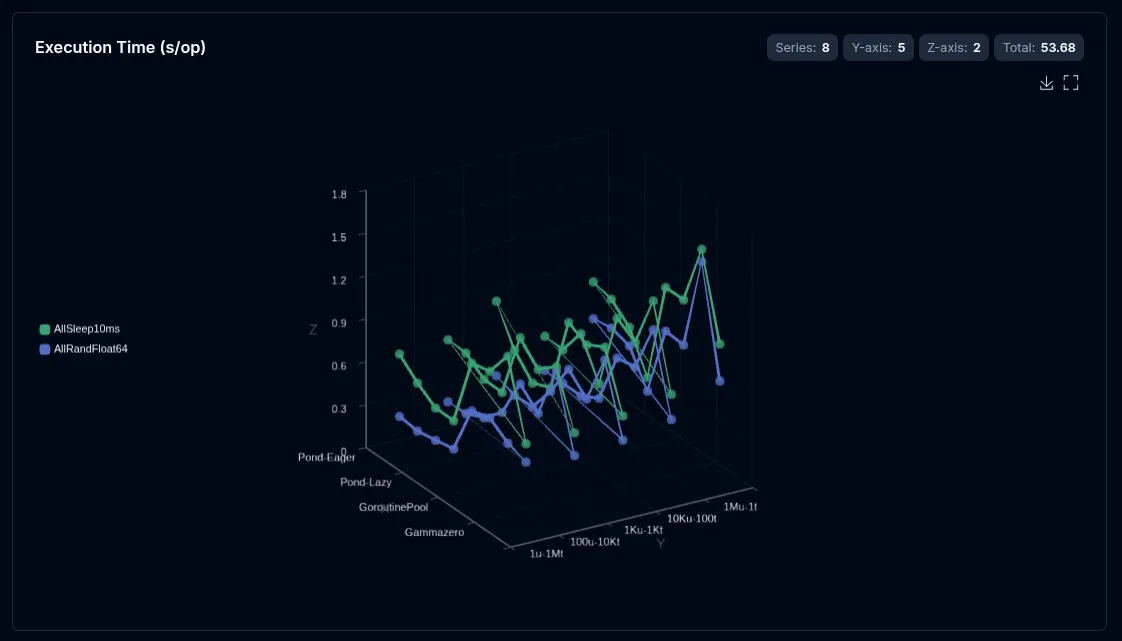
--select (csv/json)
Section titled “--select (csv/json)”--select is repeatable (csv/json only). With explicit -g / -p / -r, it picks which numeric columns get their own chart (optional {label} renames each chart). Without group, it switches to solo value / mixed / multi-stat modes that plot raw columns as coordinate axes.
vizb line sales.csv -g region,product -p x,y --select latency,sales -o lines.htmlSee Select for the full mode reference, and Group vs Select for when to use each.
Auto-value mode (all-numeric data)
Section titled “Auto-value mode (all-numeric data)”On an all-numeric CSV/JSON file, vizb auto-detects the first 2–3 columns as coordinate axes and renders value-type lines — with 3+ columns it auto-enables 3D (line3D). See Auto-value for the inference rules; solo --select overrides it.
vizb line spiral-3d.csv -o line.html --3d-visualmap --3d-rotate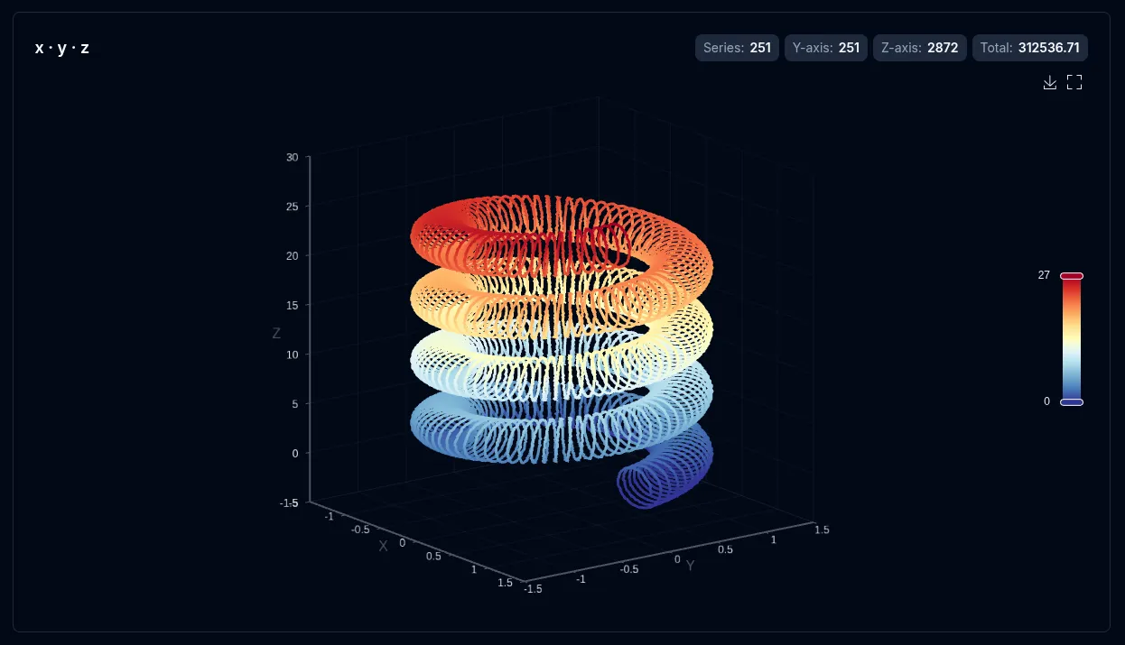
Settings
Section titled “Settings”These settings apply to line charts:
| Setting | CLI flag | UI toggle | Notes |
|---|---|---|---|
| Sort | --sort asc|desc |
Sort control | Sorts points along the X axis |
| Labels | --show-labels |
Show labels | Displays value at each data point |
| Swap | --swap |
Axis switcher | Rotates which column maps to X vs Y |
| Scale (log) | --log-scale |
Scale toggle | Log Y axis — 2D only; gaps at ≤0 |
| 3D view | --3d |
3D view | Value 3D for x+y data (y → depth, metric → height) |
| 3D visual map | --3d-visualmap |
3D visual map | Metric gradient coloring — on by default with --3d; grouped/value 3D |
| Auto-rotate | --3d-rotate |
Auto rotate | Spins the 3D scene — 3D only |
Override settings for just this chart type without affecting others:
# Log scale and labelsvizb line sales.csv -g region,category --scale log -l -o out.html
# Sort descendingvizb line sales.csv -g region,category --sort desc -o out.html